To create a button type:
注意: Types are listed in the Library only if the filename begins with a capital letter.
 (
Fill to Parent
) button to anchor the rectangle to the item.
(
Fill to Parent
) button to anchor the rectangle to the item.
You can select the text color in the Text color field and the font, size, and style in the Font 章节。
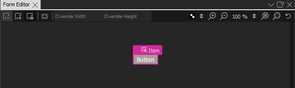
To be useful, the button type has to be created in a project. When you work on other QML files in the project to create screens or other components for the UI, the button type appears in the My QML Components tab of the Library view. You can use it to create button instances and modify their properties to assign them useful IDs, change their appearance, and set the button text for each button instance, for example.
To create a graphical button that scales beautifully without using vector graphics, use the Border Image type. For more information, see Creating Scalable Buttons and Borders .