可以使用 Border Image type to display an image, such as a PNG file, as a border and a background.
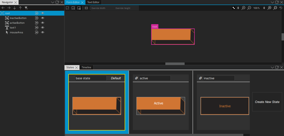
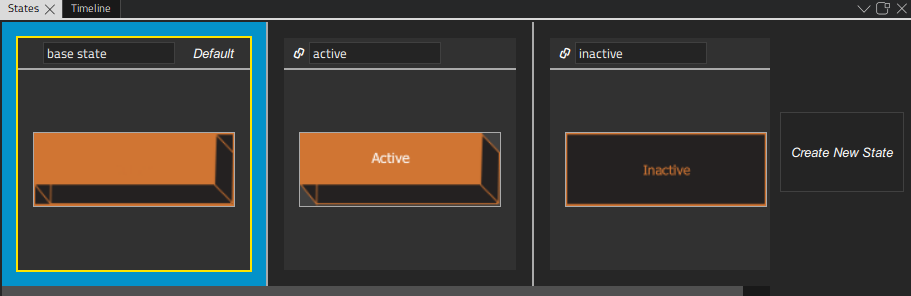
Use two border images and suitable graphics to change the appearance of a button when it is clicked. You can use use states to determine which image is visible depending on whether the mouse button is pressed down. You could add more images and states to change the appearance of the button depending on other mouse events, such as hovered.
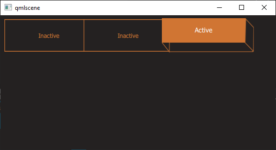
Use a Text type to add button text. You can use states also to change the button text color and font size. For example, you can scale the button text up or down.
Add a Mouse Area type that covers the whole area and reacts to mouse events.
To create a button type, select File > New File or Project > Qt > QML File (Qt Quick 2) > Choose to create a QML file called Button.qml (for example).
注意: Types are listed in the Library only if the filename begins with a capital letter.
To construct the button component:
 (
Fill to Parent
) button to always make the image the same size as its parent. This makes the button component scalable, because the image size is bound to the component size.
(
Fill to Parent
) button.
(
Fill to Parent
) button to always make the image the same size as its parent. This makes the button component scalable, because the image size is bound to the component size.
(
Fill to Parent
) button.
 (
Vertical Center
) and
(
Vertical Center
) and
 (
Horizontal Center
) buttons to inherit the vertical and horizontal centering from the parent. This ensures that the button label is centered when the component is resized.
(
Horizontal Center
) buttons to inherit the vertical and horizontal centering from the parent. This ensures that the button label is centered when the component is resized.
 , and then select
Set when Condition
to determine when the state should be applied.
, and then select
Set when Condition
to determine when the state should be applied.
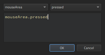
mouseArea
type and the
pressed
signal to specify that the state is applied when the mouse button is pressed down.
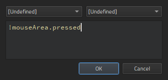
!mouseArea.pressed
to specify that the state is applied when the mouse button is not pressed down.
it in the inactive state by changing the value of its Visibility property in 特性 .
 (
Show Live Preview
) button to check how the button behaves when you click it. You can drag the preview window borders to see what happens when you resize the component.
(
Show Live Preview
) button to check how the button behaves when you click it. You can drag the preview window borders to see what happens when you resize the component.
To be useful, the button type has to be created in a project. When you work on other QML files in the project to create screens or other components for the UI, the button type appears in the My QML Components tab of the Library view. You can drag and drop it to Form Editor or Navigator to create button instances and modify the values of their properties to assign them useful IDs, change their appearance, and set the button text for each button instance, for example.
For more information about positioning buttons on screens, see Positioning Items .