The 特性 view displays all the properties of the selected item. The properties are grouped by type. The top part of the view displays properties that are common to all QML types, such as type name, id, position, size, and visibility.
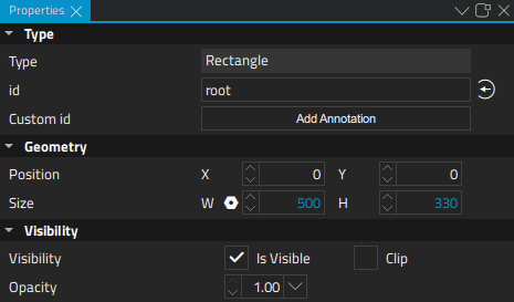
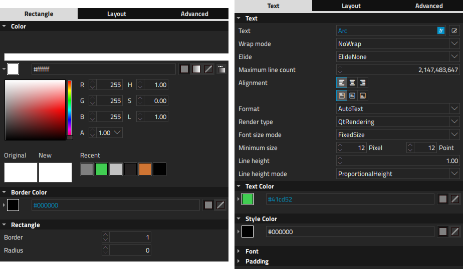
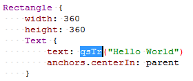
The bottom part of the view displays properties that have been defined for the QML type. For example, the following image displays the predefined properties you can set for Rectangle and Text items.
To modify the values of common properties of multiple items simultaneously, select the items in the Navigator or on the canvas:
To return an item to its implicit position after moving it, select the
 (
Reset Position
) button on the toolbar. To return it to its implicit size, select
(
Reset Position
) button on the toolbar. To return it to its implicit size, select
 (
Reset Size
) button.
(
Reset Size
) button.
To set the visibility of the item, select Edit > Visibility 在上下文菜单。
For more information on the properties available for an item, press F1 .
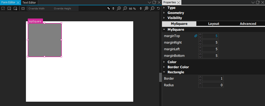
Each predefined QML type has a set of properties that you can extend by defining additional properties for your own QML components. For more information, see Specifying Dynamic Properties .
The properties you add for a QML type are displayed in the 特性 view when you select a component of that type in Navigator or Form Editor .
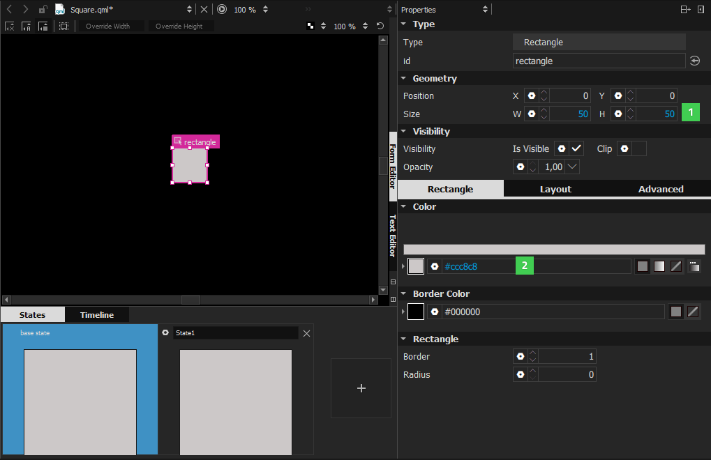
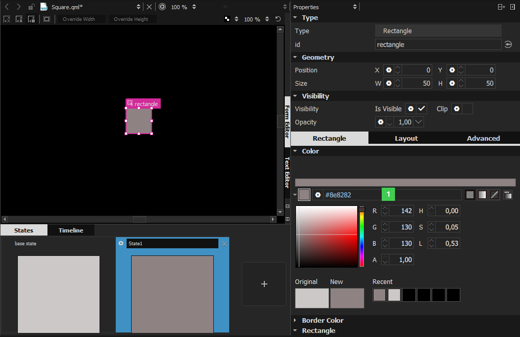
The default values of properties are displayed in white color, while the values that you specify explicitly are highlighted with blue color. In addition, property changes in states are highlighted with blue.
This allows you to easily see which values are set in the UI form or QML file and which values are default characteristics of a QML type or a component.
When editing states, you can easily see which values are explicitly set in the current state and which values are derived from the base state.
The following images illustrate this. In the base state, the Size (1) and Colors (2) values are explicitly set and highlighted.
在 State1 , only the color (1) is explicitly set and highlighted.
Resetting a property sets it back to the default value and removes the value from the UI form or QML file.
注意: As a result, all boolean values can be visualized in four different ways.
For example, visibility can be visualized as follows:
|
|
TRUE | The QML type is visible by default. The visibility might be overridden by the visibility set in the base state. |
|
|
TRUE (highlighted) | The QML type is explicitly set to visible. |
|
|
FALSE | The QML type is hidden by default. The visibility might be overridden by the visibility set in the base state. |
|
|
FALSE (hightlighted) | The type is explicitly set to hidden. |
To specify the color of the selected item in the color picker view (1), select the color picker icon (2) in the 特性 view.
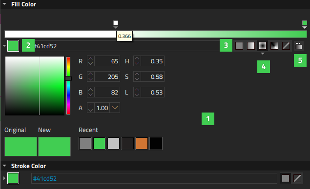
You can use either a solid color (3) or a gradient (4). You can select the gradient in the Gradient Picker (5).
The Original field displays the original color of the item, whereas the New field displays the current color. The Recent field displays the colors that you have last selected.
A gradient is defined by two or more colors, which will be blended seamlessly. The colors are specified as a set of gradient stops, each of which defines a position on the gradient bar from 0.0 to 1.0 and a color. Drag the gradient stops along the gradient bar to set their values. Select the arrow below a gradient stop to see its value as a number.
To add gradient stops, move the cursor over the gradient bar and point at it with the finger-shaped cursor. To remove gradient stops, pull them away from the gradient line.
Calculating gradients can be computationally expensive compared to the use of solid color fills or images. Consider using gradients only for static items in a UI.
The Gradient Picker enables you to specify WebGradients for QML types that support QGradient .
To open the Gradient Picker , select the Gradient Picker Dialog icon in the 特性 view.
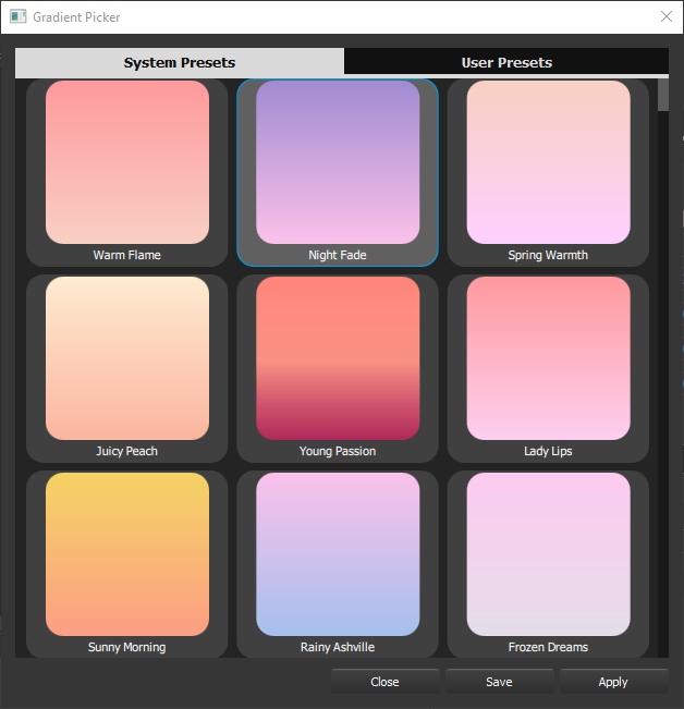
To apply a gradient on the selected item, select Apply .
To save a gradient in the User Presets tab, select Save .
By default, a linear gradient (4) is used, but you can select another supported gradient type in the 特性 view.
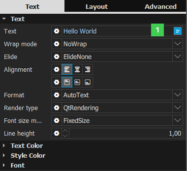
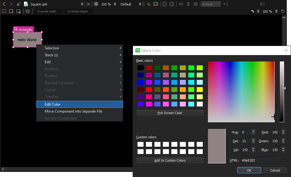
To support translators, mark each text item that should be translated. In the 特性 view, Text field, select tr (1).
By default, the text string is enclosed in a
qsTr()
调用。
If you use text IDs instead of plain text, change the default call to
qsTrId()
. Select
工具
>
Options
>
Qt Quick
>
Qt Quick Designer
, and then select the
qsTrId()
radio button in the
国际化
group. For more information about text ID based translations, see
Qt Linguist 手册:基于文本 ID 的翻译
.
To preserve the context when editing the text or to change the context by setting a binding on the text property, change the default call to
qsTranslate()
by selecting the
qsTranslate()
radio button.
更多信息,见 Qt Quick 的国际化和本地化 .
When you create a new project , you can automatically generate a translation source file (TS) for one language. You can add other languages later by editing the project file.
All QML types share a set of properties that you can specify in 特性 .
When you create a component using a QML type, the component has all the properties of the type you used. If you realize later that another QML type with another set of predefined properties would be more suitable for your purposes, you can change the component type by double-clicking the Type field and entering the name of another QML type in the field.
If you have specified values for properties that are not supported by the new type, Qt Creator offers to remove them for you. If you'd rather do this yourself, you can select the
 (
动作
) menu next to the property name, and then select
Reset
to remove the property values before trying again.
(
动作
) menu next to the property name, and then select
Reset
to remove the property values before trying again.
Each QML type and each instance of a QML type has an id that uniquely identifies it and enables other items' properties to be bound to it. You can specify ids for items in the Id field.
An id must be unique, it must begin with a lower-case letter or an underscore character, and it can contain only letters, numbers, and underscore characters.
更多信息,见 The id Attribute .
The value of the Custom id field specifies the name of an annotation .
在 Position group, you can set the position of an item on the x and y axis. The position of an item in the UI can be either absolute or relative to other items. For more information, see Positioning Items .
The z position of an item determines its position in relation to its sibling items in the type hierarchy. You can set it in the Z field in the 高级 tab.
在 Size group, you can set the width and height of an item. You can also use the resize cursor to resize 2D items in Form Editor or the scaling gizmo to scale 3D items in 3D Editor . The values in the X and Y fields change accordingly.
The item size and position can also be managed automatically when using layouts .
The width and height of the root item in a QML file determine the size of a component. The component size might also be zero (0,0) if its final size is determined by property bindings. For more information, see Previewing Component Size .
You can use the properties in the Visibility group to show and hide items.
Deselect the Is visible check box to hide an item and all its child items, unless they have explicitly been set to be visible. This might have surprise effects when using property bindings. In such cases, it may be better to use the 不透明度 特性代替。
If this property is disabled, the item will no longer receive mouse events, but will continue to receive key events and will retain the keyboard focus if it has been set by selecting the Enabled check box in the 高级 tab.
The visibility value is only affected by changes to this property or the parent's visible property. It does not change, for example, if this item moves off-screen, or if the opacity changes to 0.
在 不透明度 field, specify the opacity of an item as a number between 0.0 (fully transparent) and 1.0 (fully opaque). The specified opacity is also applied individually to child items, sometimes with surprising effects.
Changing an item's opacity does not affect whether the item receives user input events.
You can animate the opacity value to make items fade in and out.
若 Clip check box is selected, the item and its children are clipped to the bounding rectangle of the item.
You can assign any number of transformations, such as rotation and scaling, to an item in the 高级 tab of the 特性 view. Each transformation is applied in order, one at a time.
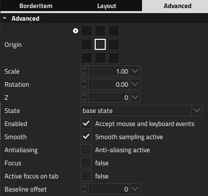
在 Origin field, select the origin point for scaling and rotation.
Set the scale factor in the Scale field. A value of less than 1.0 makes the component smaller, whereas a value greater than 1.0 makes it larger. A negative value causes the component to be mirrored in Form Editor .
在 Rotation field, specify the rotation of the component in degrees clockwise around the origin point.
在 高级 tab of the 特性 view, you can manage the more advanced properties of QML types that are based on the Item type and are mostly used by application developers.
Select the Smooth check box to activate smooth sampling. Smooth sampling is performed using linear interpolation, while non-smooth sampling is performed using the nearest neighbor. Because smooth sampling has minimal impact on performance, it is activated by default.
The value of the Baseline offset specifies the position of the item's baseline in local coordinates. The baseline of a Text item is the imaginary line on which the text sits. Controls containing text usually set their baseline to the baseline of their text. For non-text items, a default baseline offset of 0 is used.
Select the Enabled check box to allow the item to receive mouse and keyboard events. The children of the item inherit this behavior, unless you explicitly set this value for them.
You can enable the Focus check box to specify that the item has active focus and the Active focus on tab check box to add the item to the tab focus chain . The tab focus chain traverses elements by first visiting the parent, and then its children in the order they are defined. Pressing Tab on an item in the tab focus chain moves keyboard focus to the next item in the chain. Pressing back tab (usually, Shift+Tab ) moves focus to the previous item.
Qt Quick 2 makes use of a dedicated scene graph that is then traversed and rendered via a graphics API such as OpenGL ES, OpenGL, Vulkan, Metal, or Direct 3D. Using a scene graph for graphics rather than the traditional imperative painting systems, means that the scene to be rendered can be retained between frames and the complete set of primitives to render is known before rendering starts. This opens up for a number of optimizations, such as batch rendering to minimize state changes and discarding obscured primitives.
For example, if a user-interface contains a list of ten items where each item has a background color, an icon and a text. Using the traditional drawing techniques, this would result in 30 draw calls and a similar amount of state changes. A scene graph, on the other hand, could reorganize the primitives to render such that all backgrounds are drawn in one call, then all icons, then all the text, reducing the total amount of draw calls to only 3. Batching and state change reduction like this can greatly improve performance on some hardware.
You need a basic understanding of how items are rendered in QML to be able to set layer properties. Rendering is described in Qt Quick 场景图形默认渲染器 .
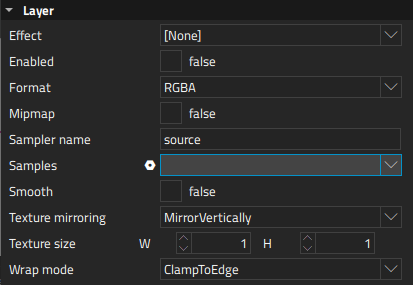
Items are normally rendered directly into the window they belong to. However, by selecting the Enabled check box in the 层 group, you can delegate the item and its entire subtree into an offscreen surface. Only the offscreen surface, a texture, will then be drawn into the window. For more information, see Item Layers .
When layering is enabled, you can use the item directly as a texture, in combination with the item you select in the Effect field. Typically, this item should be a shader effect with a source texture specified. You can use the effects in the 效果 section of Library that are based on the QML types in the Qt Graphical Effects 模块。
To enable the item to pass the layer's offscreen surface to the effect correctly, the Sampler name field is set to the source property of the texture.
Note that when an item's layer is enabled, the scene graph will allocate memory in the GPU equal to width x height x 4. In memory constrained configurations, large layers should be used with care. Also, an item using a layer cannot be batched during rendering. This means that a scene with many layered items may have performance problems.
By default, multisampling is enabled for the entire window if the scenegraph renderer is in use and the underlying graphics API supports it. By setting the value in the Samples field, you can request multisampling for a part of the scene. This way, multisampling is applied only to a particular subtree, which can lead to significant performance gain. Even then, enabling multisampling can be potentially expensive regardless of the layer's size, as it incurs a hardware and driver dependent performance and memory cost. If support for multisample renderbuffers and framebuffer blits is not available, the value is silently ignored.
The value of the Format field specifies the internal OpenGL format of the texture. Depending on the OpenGL implementation, it might allow you to save some texture memory. However, use the RGB and Alpha values with caution, because the underlying hardware and driver might not support them.
在 Texture mirroring field, specify whether the generated OpenGL texture should be mirrored by flipping it along the x or y axis. Custom mirroring can be useful if the generated texture is directly accessed by custom shaders. If no effect is specified for the layered item, mirroring has no effect on the UI representation of the item.
The item will use linear interpolation for scaling if the Smooth check box is selected. To use a mipmap for downsampling, select the Mipmap check box. Mipmapping may improve the visual quality of downscaled items. For mipmapping of single Image items, select the Mipmap check box in the image properties, instead.
To use a texture with a size different from that of the item, specify the width and height of the texture in the Texture size field.
The Wrap mode defines the OpenGL wrap modes associated with the texture. You can clamp the texture to edges or repeat it horizontally and vertically. Note that some OpenGL ES 2 implementations do not support the Repeat wrap mode with non-power-of-two textures.
You can double-click objects on the canvas to edit their text, color, or source properties inline. Because you can specify several of these properties for some QML types, such as 文本编辑 , you can also right-click objects to open the inline editors from a context-menu.