User interfaces are designed to present different interface configurations in different scenarios, or to modify their appearances in response to user interaction. Often, there are a set of changes that are made concurrently, such that the interface could be seen to be internally changing from one state to another.
This applies generally to interfaces regardless of their complexity. A photo viewer may initially present images in a grid, and when an image is clicked, change to a detailed state where the individual image is expanded and the interface is changed to present new options for image editing. At the other end of the scale, when a button is pressed, it may change to a pressed state in which its color and position are modified so that it appears to be pressed down.
In QML, any item can change between different states to apply sets of changes that modify the properties of relevant items. Each state can present a different configuration that can, for example:
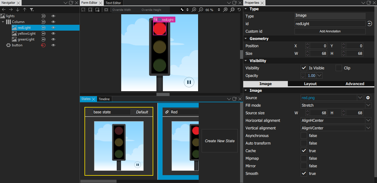
To open the States view, select View > Views > States . To collapse or expand the open view, select Toggle States or press Ctr+Alt+S . You can also right-click the view and select Collapse or Expand .
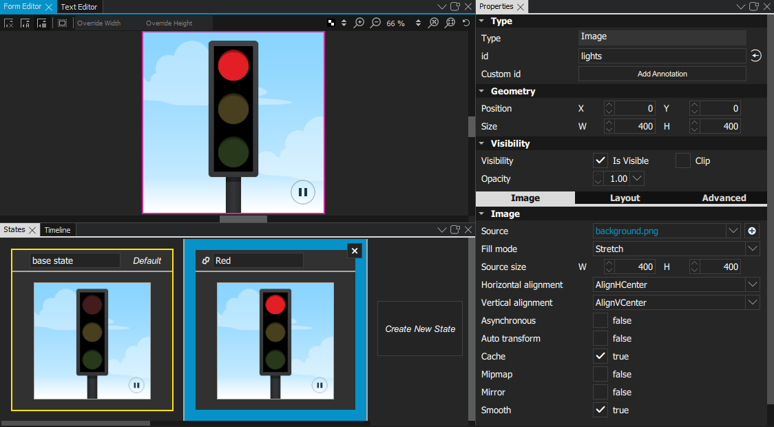
The States view displays the different states of a UI, beginning with a base state .
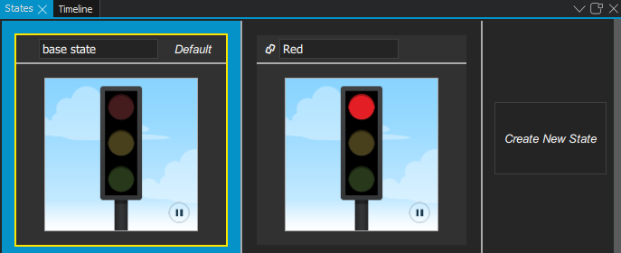
To add states, select Create New State . Click the new state to switch to it in Form Editor , and then modify the properties of components in 特性 .
For example, to change the appearance of a button, you can hide the button image and show another image in its place. Or, to add movement to the view, you can change the position of an object in Form Editor and then add animation to the change between the states.
The properties that you change in a state are highlighted with blue color. In 文本编辑器 , you can see the changes recorded as changes to the base state.
注意: If you have locked an item in Navigator , and you attempt to remove states where you change the values of its properties, you are prompted to confirm the removal.
For more information, watch the following video:
To determine the startup state of the application, select
 to open the
动作
menu, and then select
Set as Default
.
to open the
动作
menu, and then select
Set as Default
.
To reset the state later, select 动作 > Reset Default .
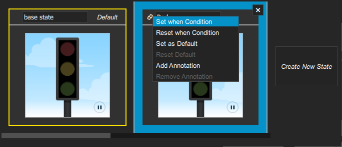
To determine when a state should be applied, select
动作
>
Set when Condition
。在
Binding Editor
, specify a
when
property for the state. Set the value of the property to a boolean expression that evaluates to
true
when you want the state to be applied.
This enables you to evaluate the truthfulness of several components' properties and move the UI to the state in which these conditions apply. You can evaluate whether something is true or false, greater than or equal to something else, and so on. You can also use operators, such as AND or OR, to evaluate the truthfulness of several components.
The when conditions are evaluated from left to right and in order of appearance in the code. Therefore, if you have two conditions for two different states that both evaluate to
true
, the first state is applied.
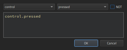
在 Binding Editor , select the component and property to create the expression. For example, to change the state when a button is pressed, you could select a button component and its pressed property.
When you compose the expressions in Binding Editor , 代码补全 feature lists the components and their properties you can use in the expressions.
You can use the following 逻辑运算符 in the expressions to combine several conditions in one expression:
| Operator | 含义 |
Evaluates to
true
if
|
|---|---|---|
| ! | NOT | The condition is not met. |
| && | AND | Both conditions are met. |
| || | OR | Either of the conditions is met. |
| < | Less than | The left operand is less than the right operand. |
| > | Greater than | The left operand is greater than the right operand. |
| >= | Greater than or equal | The left operand is greater than or equal to the right operand. |
| <= | Less than or equal | The left operand is less than or equal to the right operand. |
| == | Equal | The operands are equal. |
| === | Strict equal | The operands are equal and of the same type. |
| != | Not equal | The operands are not equal. |
| !== | Strict not equal | The operands are of the same type but not equal, or are of different type. |
In addition, you can use arithmetic operators to compare numbers before checks. However, we recommend that you create separate properties for this purpose whenever possible.
To apply a state to a button when the button is pressed, you could simply write:
when: control.pressed
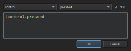
To apply a state when the button is not pressed, select the NOT check box.
To apply a state when the button is not pressed, selected, nor hovered on, you could combine conditions, as follows:
when: !control.pressed && !control.checked && !control.hovered
To apply a state when the button is pressed or selected, but not hovered on, you could write:
when: control.pressed || control.checked && !control.hovered
To keep the QML code clean, you should create a base state that contains all the types you will need in the application. You can then create states, in which you hide and show a set of items and modify their properties. This allows you to:
To create views for an application by using states:
 icon to hide items on the canvas that are not part of a view.
Normal
.
To use QML together with an SCXML state machine, add states and bind them to the state machine in the Backends tab of the Connections view, as described in Managing C++ Backend Objects .
在
States
view, you can select
动作
>
Set when Condition
to edit the
when
condition of states to map QML states to the states of the SCXML state machine. For an example, see
Qt SCXML Traffic Light QML Example (Dynamic)
.
If you add animation to the states, you can preview or run the application to test the animation.
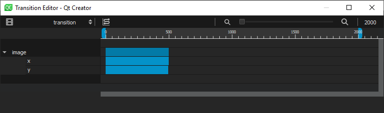
To make movement between states smooth, you can use Transition Editor to animate the changes between states. First, you need to add states 在 States view and edit some properties that can be animated, such as colors or numbers, in the 特性 view. For example, you can animate the changes in the position of an object.
在 Transition Editor , you can set the start frame, end frame, and duration for the transition of each property. You can also set an easing curve for each transition.
Use the slider on the menu bar to the zooming level in the view.
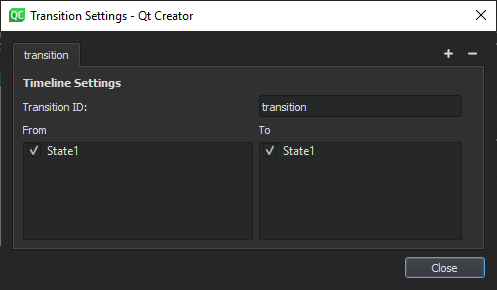
To add transitions:
 (
Add Transition
) button to add a transition. This works only if you have added at least one state and modified at least one property in it.
(
Add Transition
) button to add a transition. This works only if you have added at least one state and modified at least one property in it.
 (
Easing Curve Editor (C)
) on the toolbar. For more information, see
Editing Easing Curves
.
(
Easing Curve Editor (C)
) on the toolbar. For more information, see
Editing Easing Curves
.
 (
Transition Settings (S)
) button on the toolbar.
(
Transition Settings (S)
) button on the toolbar.
For an example of animating transitions between states, see Creating a Qt Quick Application .