This tutorial uses built-in QML types and illustrates basic concepts of Qt Quick . For more information about the UI choices you have, see 用户界面 .
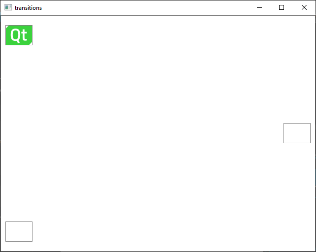
This tutorial describes how to use Qt Creator to implement Qt Quick states and transitions. We create an application that displays a Qt logo that moves between three rectangles on the page when you click them.
For more information about developing Qt Quick applications in the Design mode, see 开发 Qt Quick 应用程序 .
For examples of using Qt Quick Controls, see Qt Quick Controls Examples .
注意: Kits are listed if they have been specified in 工具 > Options > Kits (on Windows and Linux) or in Qt Creator > Preferences > Kits (on macOS). For more information, see Adding Kits .
For more information about the settings that you skipped, see Creating Qt Quick Applications .
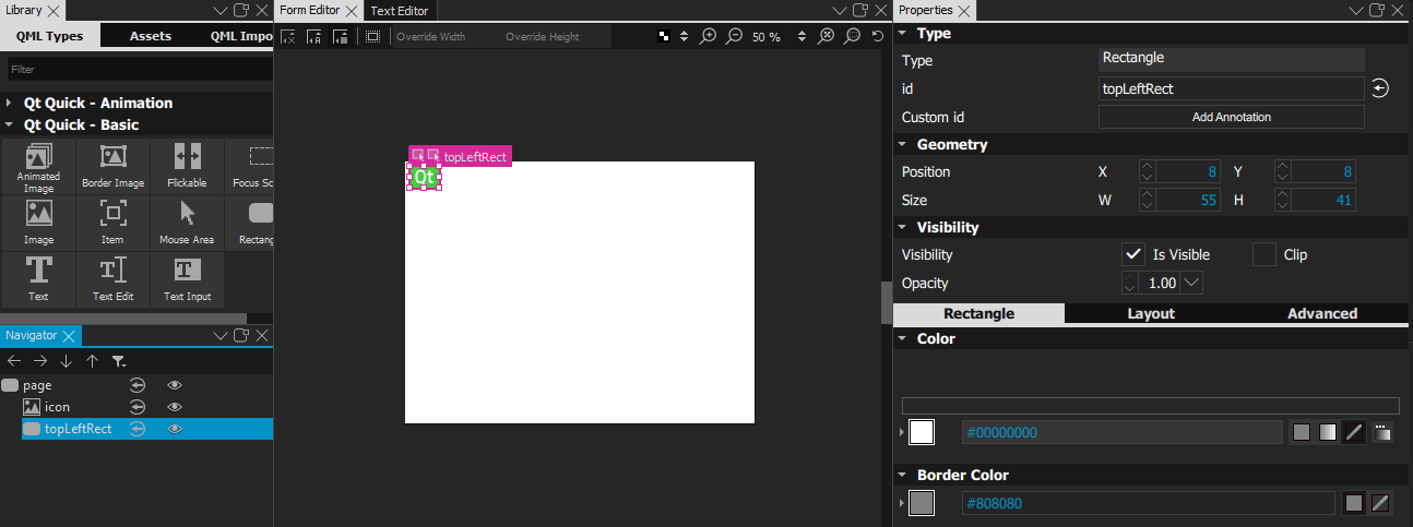
Qt Creator generates a QML file,
main.qml
, and opens it in
文本编辑器
. The wizard template uses the
Window
type, which does not support adding states. Because we want to use states in this example, we first replace the Window type with a
Rectangle
type. We must also remove the line that sets the
title
property, which the Rectangle type does not have. If you change the value of the
Type
property in the
特性
view, Qt Creator offers to automatically remove the
title
特性。
The main view of the application displays a Qt logo inside a rectangle in the top left corner of the view and two empty rectangles.
使用 qt-logo.png image in this tutorial, but you can also use any other image or a QML type, instead.
注意: If a view is hidden, you can show it by selecting View > Views .
 (
Transparent
) button to make the rectangle transparent.
(
Transparent
) button to make the rectangle transparent.
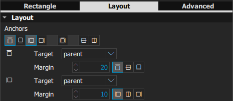
 (
Top
) and
(
Top
) and
 (
Left
) anchor buttons to anchor the rectangle to the top left corner of the page.
(
Left
) anchor buttons to anchor the rectangle to the top left corner of the page.
 (
Fill to Parent
) button to anchor the mouse area to the rectangle.
(
Fill to Parent
) button to anchor the mouse area to the rectangle.
 (
Vertical Center
anchor button and then the
(
Vertical Center
anchor button and then the
 (
Right
) anchor button to anchor the rectangle to the middle right margin of its parent.
(
Right
) anchor button to anchor the rectangle to the middle right margin of its parent.
 (
Bottom
) and
(
Left
) anchor buttons to anchor the rectangle to the bottom left margin of its parent.
(
Bottom
) and
(
Left
) anchor buttons to anchor the rectangle to the bottom left margin of its parent.
To check your code, you can view your main.qml file in the 文本编辑器 and compare it with the main.qml example file.
The UI design is now ready.

For more information about the views you used, see:
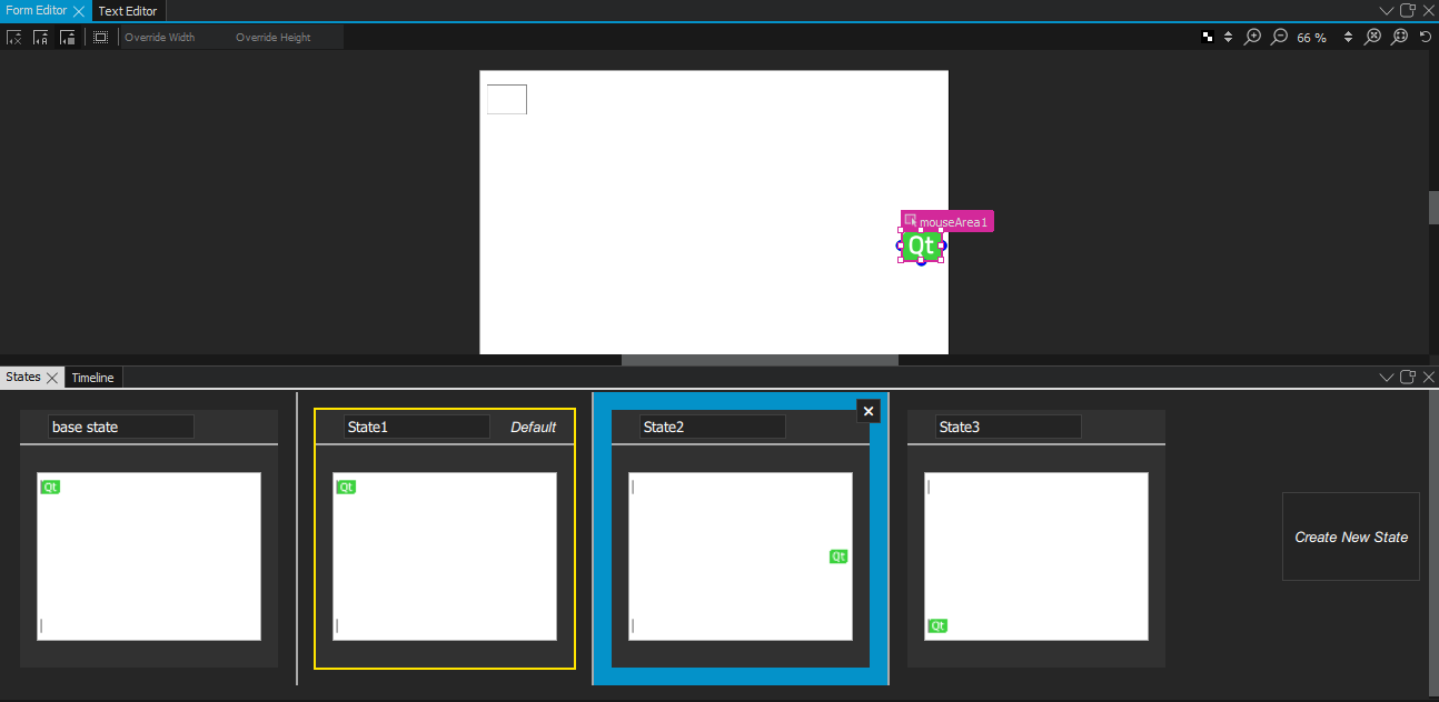
Next, we will make the image move between the rectangles when users click them by adding states and by connecting mouse clicks to state changes.
To make the image move between the rectangles when users click them, we add states, where we change the values of the
x
and
y
properties of
icon
to match those of the middle right and top left rectangles. Then, we connect the
onClicked
signals of the mouse areas to the state changes.
To make sure that the image is displayed within the rectangle when the view is scaled on different sizes of screens, we bind the values of the
x
and
y
properties of
icon
to those of the rectangles.
 to open the
动作
menu, and then select
Set as Default
to display
State1
when the application starts.
to open the
动作
menu, and then select
Set as Default
to display
State1
when the application starts.
x
and
y
property values of
icon
to match those of
middleRightRect
in
State2
.
 button to create a new connection.
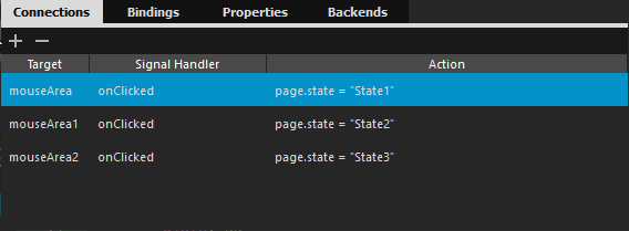
onClicked
signal of
mouseArea1
to State2, and that of
mouseArea2
to State3.
Click the rectangles to move the Qt logo from one rectangle to another.
For more information about the views you used, see:
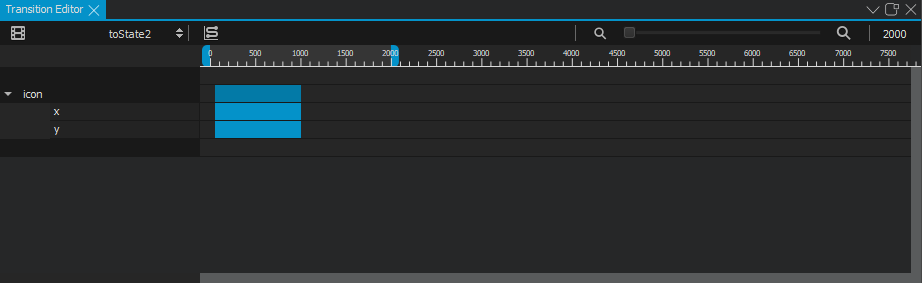
We will now create transitions to apply animation to the image. For example, the image bounces back when it moves to middleRightRect and eases into bottomLeftRect .
button to create a new transition.
 button to specify transitions for switching to each state.

to add transitions for switching to
State2
and
State3
, with the IDs
toState2
and
toState3
.
 to change the easing curve type from linear to easeOutBounce (
[0.233,0.161,0.264,0.997,0.393,0.997,0.522,0.997,0.555,0.752, 0.61,0.75,0.664,0.748,0.736,1,0.775,1,0.814,0.999,0.861,0.901,0.888, 0.901,0.916,0.901,0.923,0.995,1,1]
) in
Easing Curve Editor
.
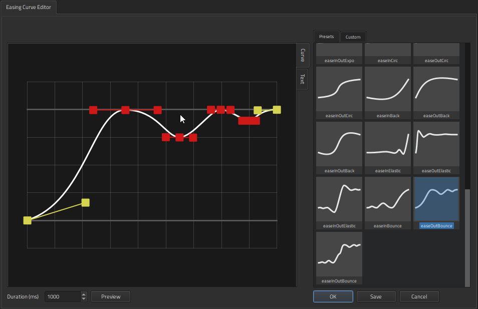
[0.455,0.03,0.515,0.955,1,1]
).
For more information about the views you used, see:
Click the rectangles to view the animated transitions.
文件:
图像: