A component provides a way of defining a new visual item that you can re-use in other QML files. A component is like a black box; it interacts with the outside world through properties, signals, and slots, and is generally defined in its own QML file. You can import components to applications.
The Library view lists the available QML types, UI components, assets, and QML imports.

The QML 类型 tab displays the QML types grouped by category, such as your own QML components, basic types, layouts, positioner types, and views.
Sets of UI components with the look and feel of a particular mobile device platform have been defined for Qt Quick 1. Since Qt 5.1, ready-made Qt Quick Controls, Dialogs, and Layouts are available for creating user interfaces using Qt Quick 2. The components and controls are based on standard QML types. To view the components and controls in Library , import the component sets in QML 导入 .
The Qt Quick Application wizards for a particular platform add the import statements automatically. You can remove import statements in QML 导入 .
Assets displays the images and other files that you import to the project folder by selecting Add New Assets .
When you drag and drop assets from the tab to Navigator or Form Editor , QML components with a suitable type are automatically created for you. For example, when using graphical assets to create components, the components will be of the Image type.

更多信息,见 Specifying Item Properties .
更多信息,见 Specifying Dynamic Properties .
The following sections describe the types of components that you can create in the Design mode.
To create an animation, use an appropriate animation type for the type of the property that is to be animated, and apply the animation depending on the type of behavior that is required.
You can drag and drop the following QML types from Library > QML 类型 > Qt Quick - Animation to Navigator or Form Editor :
For more information about using the QML types, see Qt Quick 中的动画和过渡 .
For more information about animating properties in the 时间线 view, see Creating Animations . For more information about animating property changes in states, see Animating Transitions Between States .
Qt for MCUs enables you to use subsets of QML and Qt Quick Controls types to create UIs for devices that are powered by microcontroller units (MCU). The subset of supported types depends on the Qt for MCUs version that you use for development. In this manual, we indicate which components are supported at the time of writing.
To develop for MCUs, create an MCU project . Only the types available on MCUs are displayed in the QML 类型 tab in Library . Only a subset of properties is supported for the supported types. The properties that are not available on MCUs are marked in the 特性 view by enclosing them in square brackets.

For more information about the supported QML types and their properties, see Qt for MCUs - All QML Types .
Qt Quick Controls provide lightweight QML types for creating performant user interfaces for
devices
. The controls can be
styled
. The visual editor reads the
qtquickcontrols2.conf
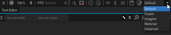
file that specifies the preferred style and some style-specific arguments. To change the style, select another style from the list on the toolbar. This enables you to check how your UI looks when using the available styles.
For an example of defining your own style and using it in the Design mode, see Qt Quick Controls 2 - Flat Style .
For more information about how to customize a particular control, see Customization Reference .
In Qt 4, ready-made Qt Quick 1 Components were provided for creating UIs with a native look and feel for a particular target platform. In Qt 5.1, Qt Quick Controls, Dialogs, and Layouts were added for creating classic desktop-style user interfaces using Qt Quick 2.1. The Qt Quick Controls Styles could be used to customize Qt Quick Controls.
Since Qt 5.7, Qt Quick Controls 2 replace Qt Quick Controls 1 and Qt Labs Controls. They provide lightweight QML types for creating performant user interfaces for devices .
Qt Quick Controls 2 work in conjunction with Qt Quick and Qt Quick Layouts.
The Qt Creator project wizards create Qt Quick applications that use Qt Quick 2 types or Qt Quick Controls 2 types.
Even if you use Qt Quick Controls 2, you can still write cross-platform applications, by using different sets of QML files for each platform.
Some ready-made controls, such as a gauge, dial, status indicator, and tumbler, are provided by the Qt Quick Extras 模块。
You can either use project wizard templates to create custom components and controls or move subcomponents into separate files to make them reusable in other components.
To use wizard templates to create custom components:
注意: Components are listed in the My QML Components tab in the Library view only if the filename begins with a capital letter.
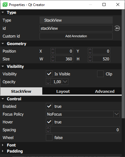
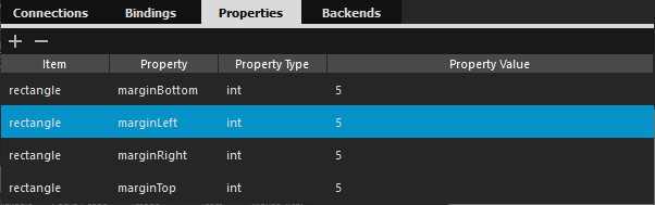
The available properties depend on the QML type. You can add properties for components 在 特性 tab of the Connection View .
The following sections contain more information about how to use Form Editor to edit 2D content, as well as examples of how to create some common components using basic QML types:
An alternative way of creating reusable components is to move them into separate QML files. Right-click a component in the Navigator or Form Editor view and select Move Component into Separate File 在上下文菜单。

Give the new component a name and select whether properties are set for the new component or for the original one.
For an example of creating a reusable custom component, see 创建移动应用程序 .
The QML files that specify components can contain instances of other components specified in separate QML files. You can open the QML file that specifies a component in different ways from different views:
The component hierarchy is displayed as a bread crumb path, where you can click the component names to open the respective files. This enables you to easily navigate back to the top level when you are done editing the component.
You can merge the current QML file against an existing second QML file and using the second QML file in a way similar to using a CSS stylesheet.
To use this experimental feature, right-click a component in the Navigator or Form Editor view and select Merge File with Template 在上下文菜单。

在 Template field, select the file to use as a template.